Category Archives: Blogazine

Repurposing Old Content and Packaging it in New Ways

Seaberry Design Image Refreshing your content

As designers we like to take cues from the world around us. So when spring floods us with beautiful signs of growth and renewal we look for ways to bring some fresh energy into the marketing mix for our clients

One easy method we highly recommend is to repurpose and repackage old content. Just like mother nature, we take something dormant and old and breathe new life into it, to grow an audience or cultivate a brand new one.

The effort can be as small as revisiting old newsletters, and repackaging them for your social media channels or curating a space for them on your website. Or, it can be as big as taking old and unused content and developing a whole new experience around it.

Our Director of User Centered Design, Laate Olukotun, just recently wrapped up a repurposing project for one of our partners, the Federal City Council. The organization had a number of videos sitting in their dropbox, that they would send out links to via e-mail. So we worked with them to design and create an online platform where their online community could get access to archived video content and experience it in a brand new, sophisticated, and cataloged way.


No matter how you do it, the benefits of repurposing your content are real:

  • It Saves You Time: Time is precious and you don’t always have the availability to dive deep into a new content creation process. Revamping or repackaging old work can put you in the fast lane to finished, shareable content.
  • It Makes Good Content Great: Chances are what you made before was pretty great and if it wasn’t it may just need a little boost or update to achieve greatness.
  • It Captures New Audience Members: An original piece of content may have reached only one group of customers on one platform. Repurposing content for different mediums and channels, and even updating how it is packaged, can help you reach new audiences.
  • Repetition Works: The more your audience receives your message the more likely it is to sink in.


Where to start? Here are few easy ways you can give old content new life:

Got Videos?

  • Convert your video content into blog posts
  • Transform your videos into short Instagram reels
  • Create a home for your social media videos on your website
  • Turn information dense videos into webinars
  • Turn videos of customer testimonials into ads

Got Newsletters?

  • Link to previous content in a “Roundup Newsletter”
  • Make new YouTube videos or Instagram reels out of old newsletter topics
  • Summarize newsletter content in an Instagram carousel
  • Design a custom home for your newsletters on your website
  • Use old pieces of content as the foundation for an email course

Old Blog Posts?

  • Create a Slideshare presentation
  • Take your content that provides educational value and turn it into an ebook
  • Take powerful thoughts or quotes and design social media posts around them
  • Record audio versions of your blog post
  • Republish your content on Medium, LinkedIn and more

And as always, don't hesitate to reach out. We’ll help you figure out what to do.

Women Who Changed the Game in Graphic Design:

Seaberry Design Image Women who changed the game in graphic design

As a black-owned, woman-owned business, February and March are important in the Seaberry office. Last month we celebrated trailblazing African American graphic designers for Black History Month. Now, for Women’s History Month, we’re giving recognition to women that have changed the game in an industry that, like many, has struggled to give women the recognition and compensation they deserve for their work and contributions.

According to Kerning the Gap, only 17 percent of creative directors are female even though 63% of design students are female. Even worse, the gender pay gap between men and women is still over 20%.

Creativity and innovation are key to forging a gender equitable world. Good news is, and as the women highlighted below prove, creativity is something women have in spades.  


Carolyn Davidson

Carolyn Davidson is the creator of one of the most recognizable brand logos in the entire world — the Nike swoosh.

Davidson came up with the design in 1971 while studying graphic design at Portland State University. At the time, Nike founder Phil Knight was teaching accounting at the university and asked Davidson to do some work for what was then Blue Ribbon Sports, Inc. (later Nike). She started off creating charts and graphics which lead to posters, ads and flyers, and eventually a logo for a new line of running shoes that Knight and his co-founder were ready to introduce. For the shoe logo Knight asked Davidson to design something that had to do with movement.

Davidson submitted five different designs, one of which was a swoosh that resembled a wing and hinted at Nike, the Greek goddess of victory. She only charged Knight for 17.5 hours of work which brought her invoice to a whopping $35.

Davidson didn’t profit immediately from her work on the Swoosh, but in 1983 she was celebrated by the company and given 500 shares of stock (estimated to be worth upwards of $1,000,000 in 2015), as well as a diamond and gold ring featuring the Swoosh design.

Davidson, now known as “The Logo Lady,” continued to design for Nike until 1975. After that she went solo as a freelance designer, which she continued to do for about 30 years.


Susan Kare

Susan Kare is an American graphic designer who is celebrated as one of the most significant technologists in history. Why? She designed the core visual design language of the original Macintosh, from original marketing materials to typefaces and icons, and in true female fashion, she designed it all in the span of a year. Many of her designs remain the icons for computer graphics tools today — like the lasso, the grabber and the paint bucket.

It all started for Kare in 1982 when she received a call from her high school friend Andy Herzfeld, who, in exchange for an Apple II computer, solicited her to hand-draw a few icons and font elements to inspire the upcoming Macintosh computer. With no experience in computer graphics, Kare drew upon her fine art experience with mosaic, needlepoint and pointillism and mocked up several 32 x 32 representations of software commands and applications in a $2.50 cent graph paper notebook.

In addition to creating iconic icons, Kare also devised the practice of associating unique document icons with their creator applications and she designed the world's first proportionally spaced digital font families including Chicago, Geneva, and the monospaced Monaco.

The Smithsonian Institution called her design language "simple, elegant, and whimsical."  Not only is she an AIGA award winner, in 2019 Kare was also awarded the National Design Award for Lifetime Achievement by the Cooper-Hewitt, National Design Museum.


Bea Feitler

Bea Feitler was once described as “the pioneering female art director you’ve never heard of.” You may not know her name but Fietler worked as an art director and designer for big name publications like Harper’s Bazaar, Ms. Magazine, Rolling Stone, and Vanity Fair.

During her tenure at Harper's Bazaar Feitler often created high quality editorial designs that responded to the political and cultural changes of the 1960s. Her work was striking, colorful and often gave voice to feminism.

Known for having been ahead of her time, Feitler broke all norms in 1965 when she placed Donyale Luna, the first black supermodel, on the cover of Harper’s bazaar. The decision led to public backlash, and a loss of business, but Feitler stood by it. It wasn't until several years later that black women would begin to be regularly featured in the magazine.

Feitler worked on several high profile freelance projects as well, which included posters and costumes for the Alvin Ailey Dance Company, ad campaigns for Christian Dior, Diane von Furstenberg, and Calvin Klein, and record jackets including the album ‘Black and Blue’ by the Rolling Stones.

Her final project was the premiere issue of the revived Vanity Fair. While working on it Fietler was in the midst of treatment for a rare form of cancer. Feitler unfortunately died April 8, 1982, before the issue was published.


Dorothy Hayes

Dorothy Hayes was an artist, sculptor and graphic designer from mobile Alabama who fought to gain respect for female designers especially women of color.

Hayes came to New York City in the 1960s to build a career for herself as a graphic designer. She worked as an art director, art and production supervisor, and a layout and mechanical artist for various advertising agencies, publishers and art and production houses in New York City.

In each experience Hayes struggled with the lack of visibility in the industry for women and women of color. So in a bid to give people of color a voice in the design world, Hayes teamed up with book designer Joyce Hopkins in 1970 to curate the exhibition, Black Artists in Graphic Communication, at the Rhode Island School of Design. The groundbreaking exhibition profiled 49 young Black designers, including Dorothy Akubuiro, Josephine Jones, and Diane Dillion.

Hayes also founded Dorothy's Door, a commercial art and design company that made work for clients such as CBS Radio and AT&T.


Jane Davis Doggett

Next time you arrive at an airport and those familiar signs, with the big terminal letters on bright colored backgrounds, direct you where to go, be sure to give a little thanks to our last designer, Jane Davis Doggett. Doggett is one of the most prominent wayfinding system designers in the Modernist era. She harnessed color, scale, and the alphabet to humanize large spaces like major airports, stations, and venues.

Doggett got her first airport design job in 1959, creating wayfinding systems for the Memphis Airport. Her first innovation was the development of a standardized front for use throughout the airport. The font became Doggett’s trademarked “Alphabet A” and was used in many subsequent airport projects since it was readable over long distances. She also pioneered the use of color-codes and letters to identify terminals at airports as well as the concept of including geographical and cultural aspects inside of airports.

As of 2014 Doggett had designed the wayfinding systems for 40 major airports including Tampa International, George Bush-Houston, Baltimore-Washington, Newark, Miami, Fort Lauderdale-Hollywood, and Cleveland-Hopkins among others. Each year, an estimated 20 million airplane passengers are guided by her way-finding signage and graphics.

Doggett's designs have been awarded the American Institute of Architects’ National Award of Merit, the Progressive Architecture Design Award, and two Design Awards co-sponsored by the U.S. Department of Transportation and the National Endowment for the Arts.

The OGs of African American Graphic Design

Seaberry Design Image The O.G.'s of graphic design

Diversity is often missing from the annals of history. People of color and women, the invisible trailblazers whose talents and accomplishments have shaped our world, too often go unrecognized, though their impacts are felt throughout history and they should be acknowledged. 

With this in mind, for Black History Month we’re excited to highlight some of the African American creatives and artists who have shaped the field of design, branding and advertising. These are just a few of the many…

Charles Dawson (1889 - 1981)

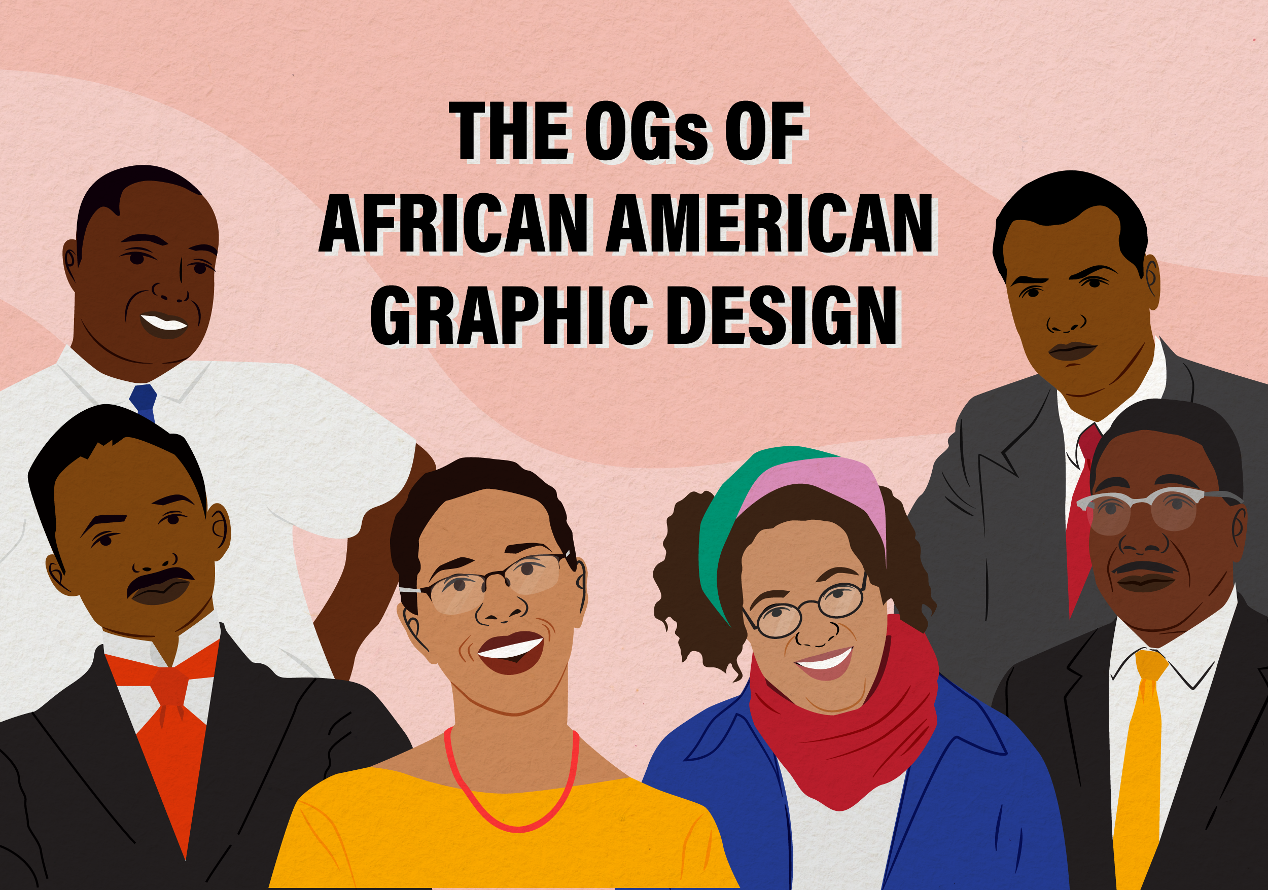
Murray’s pomade, the hair care product in an iconic bright orange tin, is one of the world’s leading hair pomades — used by A-listers like Leonardo DiCaprio and Justin Timberlake — Its original design was created by our first designer, Charles Dawson.

Dawson, a printmaker, illustrator and graphic designer, was one of the leading black artists and designers of the 1920s and 30s.  He was the first African American to be admitted into the Arts Students league of New York, and attended the Art Institute of Chicago where he became a founding member of the first black artists collective, The Arts and Letters Collective.

As a graphic designer he is best known for his illustrated advertisements for beauty schools and products for Annie Malone’s Poro College and Valmor Products, which were targeted to black consumers. He also took part in two different Works Progress Administration programs, under Roosevelt’s New Deal, including the National Youth Administration where he designed the layout for the American Negro Exposition, a piece composed of 20 dioramas showcasing African American history.


Aaron Douglas (1899 - 1979)

Aaron Douglas was an African-American painter and graphic artist who played a leading role in the Harlem Renaissance of the 1920s and 30s.

Sometimes referred to as the “father of Black American art,” Douglas contributed illustrations to Opportunity, the National Urban League's magazine, and to The Crisis, put out by the National Association for the Advancement of Colored People.

In the 1920s, with his growing reputation for creating compelling graphics, Douglas received a commission to illustrate an anthology of philosopher Alain LeRoy Locke's work, entitled The New Negro and became an in-demand illustrator for many writers. Some of his most famous illustration projects include his images for James Weldon Johnson's poetic work, God's Trombone (1927), and Paul Morand's Black Magic (1929). Douglass is said to have pioneered the African-American modernist movement — combining a modern aesthetic with ancient African art.

In his later years, Aaron Douglas received countless honors for his work. In 1963, he was invited by President John F. Kennedy to attend a celebration of the centennial of the Emancipation Proclamation, held at the White House. He also earned an honorary doctorate from Fisk University, where he taught and established the Carl Van Vechten Gallery of Art.


Georg Olden (1920 - 1975)

Georg Olden helped to create the visual identities of some of film and televisions most iconic programs. We’re talking Gunsmoke, I love Lucy, and Lassie to name a few.

Olden began his career in graphic design during World War II when he went to work for the Office of Strategic Services. There he published cartoons in National CIO News, The New Yorker, and Esquire.

After the war, Olden took a job working at CBS. One of the first African Americans to work in television, He’s credited with growing their on air art division from a one-man operation involved with six programs a week, to a staff of 14 in charge of 60 weekly shows.

An AIGA Medal winner, Olden not only served as a VP Senior Art director at the major firm McCann Erickson, he was also the first African American to design a postage stamp for the United States Postal Service. The design commemorated the centennial of the Emancipation Proclamation with a simple graphic of a broken chain in black on a blue background. The iconic image is still used and referenced by designers all over the world today.


Thomas Miller (1920 - 2012)

Thomas Miller was a pioneering graphic designer and visual artist in the 1960s and 70s and is considered the first African American to break into the mainstream profession of graphic artist.

Miller made his mark as a key designer for Morton Goldsholl Associates, the internationally renowned design firm, where he led multiple identity redesigns for well-known brands like the Peace Corps, Bauer & Black and more. He designed Motorola’s batwing “M” in the 60s, and 7UP’s famous bubble formation logo in the 70s.

Miller worked on logo design, packaging, exhibition displays, stop-motion and video animation. He experimented with many techniques that are now staples of video production and digital graphics.

His best known publicly accessible work is a collection of mosaics of the founders of the DuSable Museum of African American History in Chicago, Illinois.


Sylvia Harris (1953 - 2011)

If you filled out a 2020 United States Census form then you have come in contact with Sylvia Harris’s work. Harris was an African American graphic designer and design strategist who is considered a pioneer in the field of social impact design.

As the founder and principle of Citizen Research & Design, Harris specialized in creating wayfinding graphics and improved communication in the public realm. Her company guided some of the nation’s largest hospitals, universities and civic agencies through systems planning, policy development and innovation management. In her role as creative director for the US Census Bureau’s Census 2000, Harris’ rebranding efforts helped to encourage previously under-represented citizens to participate.

Harris passed away unexpectedly in 2011. In 2014, she was posthumously awarded AIGA’s highest honor and most distinguished award, the AIGA Medal. Additionally, AIGA established the Sylvia Harris Citizen Design Award to honor her dedication to the field of social impact design.


Gail Anderson (1962 - )

Gail Anderson is most known for her 15 years worth of illustrations and typographic work for Rolling Stone Magazine where she held the title of Senior Art Director. Anderson’s passion for bold innovative design defined the magazine’s feature pages.

Her career has ranged from magazine design to teaching, packaging, writing, designing for academia and designing for the theater. In 2002 Anderson began working at SpotCo to create artwork for Broadway and off-Broadway plays. The Avenue Q subway-inspired puppet-fur logo that she designed became a core part of the play’s marketing.

In 2018 Harris became the first woman of color to be honored with the American National Design Awards’ Lifetime Achievement from the Smithsonian Design Museum.

Yet, despite her diverse career and numerous accomplishments, Anderson says her smallest project, designing the postage stamp commemorating the 150th anniversary of the Emancipation Proclamation, is the one that makes her the proudest.

3 Easy Ways to Make the Most of Your Marketing Budget

Seaberry Design Image five reasons to invest in graphic design

With a new year comes new beginnings and the opportunity to take bold new steps with your brand. That means now is the perfect time to look back at what worked and what didn’t last year, and to think of ways to do things even better in 2023. One way to do this is by assessing your marketing budget and thinking of the best, most efficient way of using it. We know that’s sometimes easier said than done. So, we’re breaking down the top 3 ways we think brands can get the most out of their marketing budget in 2023.


Promote the New

One of the best ways to determine how to use your marketing budget in the new year is to look at your brand overall, and consider how you want it to evolve in 2023. Ask yourself, what’s new? Will you be making adjustments to your brand identity, your logo, brand colors or your tagline? Do you have a new approach to customer service or new messaging? Or perhaps your brand will be developing new products or sub brands. If you’ve got something new going on — promote it! Invest in getting new information into the marketplace with fresh visuals and messaging that make an impact. Your customers will appreciate how much effort you put into growing and evolving your products and services and that will translate into more business. 

Make a Video

There was a time when having just a homepage was enough. But as the internet becomes more and more advanced it’s essential for companies to take advantage of all the ways websites can be used to grow business. Take video for instance, video plays a really important role in branding, especially online. It allows organizations to effectively communicate with their audience across a number of platforms using a myriad of different video styles and formats. These days, one video can engage thousands of new people in just one day!

The benefits are immediate. One example of this is a project we did last year. We made an informational video for The Mary Elizabeth House highlighting their CEO’s mission and plans for the future. The full video was featured on their website. We edited a shorter version of the video and formatted it for each of their social media channels which in turn has been driving a lot of traffic to their website. A simple video, packaged for different media channels, goes a long way and is a really easy approach to breathing new life into your marketing communications.

Send Snail Mail

Snail mail is making a comeback! Back when email first became popular, people stopped reading snail mail. But now, as I’m sure we’ve all experienced, our inboxes are completely stuffed with all sorts of marketing emails and promotions. That has slowed e-mail usage down, and left people longing for (drum roll please…) that good ole snail mail again! For brands, this creates new marketing opportunities,  like designing brochures, one pagers, and postcards that can reach customers via a real mailbox. This throwback might sound crazy, but it’s definitely a trend to consider in 2023.  

Could There be More?

While these are 3 easy ways to get the most out of your marketing budget this year, another great way to keep your company and brand strong in 2023 is by starting the year out embracing your staff. Everyone is in the “new year, new you” zone so why not capitalize on those warm fuzzy feelings? Motivating staff can be fun, and  as easy as providing advertising specialities like t-shirts or sweatshirts (which we make!), that let the staff know you care about them and are thinking about them. Or it can be as simple as reaching out and keeping in touch — letting your staff know that they were appreciated in 2022 and that you look forward to working with them in 2023.

Good energy and a motivated staff keep your business performing at its best, and that’s reflected when customers come in contact with your company, and well, what better marketing is there than that?

10 Questions With Seaberry Producer Andrew Robinson

Seaberry Design Image five reasons to invest in graphic design

By Nicole Arias

Our video producer, Andrew has been behind the camera doing what he loves since childhood. He has used his passion and talents in a variety of settings, for all kinds of different projects which, lucky for us, has made him a very versatile video producer. Andrew is an essential part of our team, with a great eye and sense of humor. I recently talked to him about his role as a video producer and got some tips for new producers starting out in the industry. Check out our 10 questions with Andrew Robinson.

What made you decide to become a video producer?

I don't think there was one specific moment. I started when I was about 6 years old. I picked up one of those old VHS cameras that my parents had and just started playing around with it. I found out later you could put the footage into a computer, and by editing it, change the chronological order of things. So, if I wanted to record something from one moment, I could edit that together with something from a completely different moment in time. Things could be non-linear and I thought that was really cool.

What do you like about storytelling? 

I think the one big thing I like about storytelling is being able to shape and change people's perceptions about a particular issue or topic. I can take different perspectives and together with what I observe and what I see, I can deliver audiences a whole new viewpoint on something — a new spin on it.

What gets you excited about a project? Do you ever have a moment of, “This is what I do this for!”? And if so, when does that kind of feeling come about?

Really it's when I'm on set and I get to see firsthand the plan I put together during pre-production come to fruition. I just get energized from that. But also in post production I see what I gathered in the field and I get to manipulate it and put it all together to tell a story. For me, during that part of the process, I feel that same energy being revitalized. And then the BEST feeling out of all of them is when the client sees the video and they just absolutely love it. Especially when we’ve been able to show them a new point of view, shed light on something, or deliver new information.


Can you tell me about one of your favorite projects you've worked on/are currently working on?

I think my favorite assignment so far was to film in Haiti for a nonprofit based out of DC. I went with them for a week and embedded myself with their team to document some of the medical work they did in Haiti. It was a really eye-opening experience because there's a lot of poverty. Nothing I'd ever seen before. There was no electricity, no running water, — nothing. So I had to navigate those sorts of challenges while filming and remove myself from the modern luxuries that I have when working in the U.S. As a videographer, you can often feel like an observer, separated from the experiences of your subject. But on that assignment I felt very connected with the people there. 

And another favorite project I would say, is doing the neighborhood highlights I’ve been working on lately. I’ve been going into DC’s wonderful neighborhoods to capture art and design elements that our team loves as designers. I've lived in the District for almost 14 years now collectively, but I hadn't really seen a whole lot of the art side of DC. So being able to go back into these places I know and look at them from a different perspective is really cool. 

What are three things you can’t do without as a videographer? Whether it’s a piece of tech, an approach, maybe a helpful hack you’ve discovered…

Honestly, it boils down to the gear. I can't do without a 50 mm, 18 and 35 mm lens. I use the 18 and 35 basically on every single shoot, because they are the most versatile. You can really get different looks and different feelings from those two focal lengths. The team at Seaberry often describes my shooting style as dreamy and I can achieve that effect, and also a more standard look, by using just those two lenses. And then a third thing I can't do without is a dolly because I have so much gear!

Where do you get your inspiration from?

This is going to sound so cliché haha, but honestly I get my inspiration from Netflix and other streaming services. I don't really watch mainstream stuff. I enjoy looking at films from France for instance or Italy and seeing what filmmakers there are doing and thinking about. Then I try to figure out how I can reverse engineer what they’ve done and do it myself. I just really enjoy that process of working backwards to try and figure out what someone else has done. 

What are your favorite types of videos to make? And what excites you about making those?

I like making profiles. Showcasing a person, who they are, what they do and why they do it is so interesting. But I also love making timelapses because they are a combination of photography and videography. I actually got started in photography before I got into videography, and timelapses combine both mediums. With timelapses, I get to make a stationary shot more dynamic by figuring out compositionally how a series of photos are going to look interesting as a video.

What are some of the most important skills for a video producer to have? 

I'd say time management and organization are key — outside of technical stuff. Because if you are bouncing between a whole lot of projects at once and you're not organized, you're going to feel overwhelmed and drowned by everything. But when things are organized you get a clear picture of where things stand. You are able to plan ahead, so come shoot time or editing, you’re being proactive in crafting your story instead of reactive. 

What are your thoughts on the future of the video industry and your profession? Where do you think things are headed?

I think about this everyday. When I was in school they taught you, if you're a videographer you need to know how to edit or if you're an editor then you need to learn how to shoot and that was the case years ago. Now it's standard that if you're a shooter you know how to edit. Going forward it's going to be much more important to not only know how to shoot and edit but also how social media platforms work and the different algorithms that play into those. And then in terms of the types of videos that will be appealing, I'd say that the future lies in being able to understand buyers' psychology and what they want, and providing videos that deliver that in an entertaining and educational way.

What advice or tips would you give video producers who are just starting out?

Gear does matter to an extent, but if you are someone just starting out, don’t get caught up in it. It can be easy to focus too much on what gear you have, believing that the gear will make the story. It doesn’t. You have to craft a story. You have to tell a story. In this day and age you can shoot something on your phone and have a huge impact. Yes, you want your video to look good, don’t get me wrong. But you also want it to say something. If the story is amazing, people are going to be engaged.

Is Investing in Graphic Design Worth It?

Seaberry Design Image five reasons to invest in graphic design

It’s easy for businesses to overlook the importance of investing in great design but here are 5 reasons why this investment can pay big dividends.


First impressions count..

Everybody is a consumer, everyone makes choices — even you — and consumers naturally understand how important a good first impression is when choosing products and services. Whether they are looking at a new product line, searching for a place to eat, or visiting a new company’s website, the initial feelings consumers get about a brand are based on its visual design and how attracted customers are to it. One study found that web users form an opinion of a company after just 50 milliseconds of landing on a website. So that first impression can make or break your business pretty quickly. Making sure that the visuals you use resonate with your audience is essential in getting them to choose your business. 

Graphic design strengthens your brand name

Savvy customers expect your brand to be consistent. In movies, when an actor’s shirt or hair suddenly shifts from one camera angle to another, audiences call foul. Their brains glitch for a second and their focus shifts to whether there will be other gaffs. But when scenes flow easily from one to the next, the story becomes powerful. The same is true with graphic design. When audiences see something they like – and it is executed flawlessly again and again – they remember it. Investing in great design and keeping that design consistent across platforms gives your audience something to remember you by. The more customers recognize you, the more reasons they’ll have to think about you and interact with you.

Good design sells

Like having a website and a company email, a polished brand image shows customers you are professional and know how to run your business, and that sells. When customers see high quality branding and visuals they perceive your offerings to be of the same great quality, which puts you more in demand and able to command higher prices for your products and services. 


Graphic design builds a stronger team

Employees want to work for a company they can be proud of. Visual elements like a strong logo and branding, polished and modern marketing materials, branding displayed throughout the office, even company t-shirts, show your team members you are confident in the business and its future and makes them feel they are working for a company that is worth their time and effort. That translates to a more motivated team, a boost in retention, and an overall better reputation for your company.


Collaborative work personalized for your business

With a graphic design agency by your side you get a full team of professionals that will spend time studying your business, your market, your needs and your goals. Designers collaborate with you and share ideas on exactly how to create your vision and communicate it to your customers. Best of all, their creative work is custom, and tailored to fit exactly what you're looking for, all while using on trend, professional design that is sure to increase sales.


Get started on making a great first impression!

10 Questions with Seaberry Senior Designer Emily Hu

Photo of Graphic Designer Monica Seaberry on her graphic design Studio

By Nicole Arias

Emily Hu is a lover of art, a master of layout design, and an integral part of the Seaberry Design team. 

Seaberry Design is all about colors, culture and creativity and they have a team that represents just that. I sat down with Emily to learn a bit more about her role as a senior designer for Seaberry, how she got her start in the industry, and what really motivates her as a creator. Here are 10 questions with designer Emily Hu.

What made you decide to be a designer?

Well, growing up in Taiwan my childhood dream was to be an artist or illustrator or a cartoonist. I love to draw and doodle. When I looked at books, it wasn’t about reading like it is for most people. For me it was about the pictures and how they designed it. When I came to the US for college and to start my career, I thought of what I could do to make my hobby a job and I came across graphic design. So I started studying graphic design and became a designer. I know it's not the same as my childhood dream, but it is close enough and I like it — A LOT. 

In your opinion, what makes a good designer? 

Hmm, a good designer designs for their clients and not just themselves. 

You are known among the team as a master of layout design. Talk to me about some of the elements of layout design?

So the elements of layout design can be color, text, graphics, and consistency. Color is hard because you can draw black and white on paper really well, but when you include color, your work can become totally different. The lighting, the contrast and the shading can change how everything looks. It's one thing I'm still learning. But I think you just keep looking at other people’s work to train your eyes, so then you know what colors you’ve been using, and what colors you can use to make your work better.

What about text as an element? 

Text can be typeface and typography. I do really like typography; all the different fonts have different feelings to them. Fonts can make people see the world and your work differently. Some fonts can be more serious and some can be more fun and modern. Each font is different and each can impact how your audience feels looking at your work.  

How do you arrange all the various elements and make sure your work is balanced and not too busy?

When I design I usually focus on the audience. Layout design is meant to help the viewer read things more easily and smoothly. So, if a lot of information is given to us, then we need to determine what the most important things are and the focus of the project. Then maybe we can use a shape, or change the colors, or make things bold, so people will focus on the information that is most important — what we need them to focus on. 

Walk me through your design process.

First, I learn about our client and what our client is looking for. The more we know about the project and the client, the more we can provide to them. Once I know the project and the client's vision, I then do research. I look at other designers' work and find inspiration. For example when I make a logo, I write out all the keywords that the client used for the company. I think about the feeling they are going for — it could be fun or serious. I look at who their audience is, and what they want the audience to feel when they see the work. I do the same with fonts — do they want serious, or happy? And colors, like fun can be yellow, or serious can be dark blue. Those keywords really help me to create a design. 


What do you do to improve your design skills?

I look at other designers’ work and get inspired by them. I'm not saying I copy their work. But you find some cool stuff you like and then you make it your style. You add your own touch to it. Once you've been exploring different types of work for a long time then you figure out what's good and you’re able to create your own style. 

What is a simple tip designers can use to better their work?

Focus on your audience. Make sure you know what the client wants and that the viewer  can get to the important information when they read it. I have friends who aren't professional designers and they'll show me their work to get my advice. And for example, they may put text on top of a picture, but the picture is so busy you can't really read the text or focus on the words. It might look cool, but if the reader can't read it, then what's the purpose of the work?

What do you enjoy most about your job?

My hobby is my job and I don't get tired of it. Some people would think having your hobby as your job would make you grow tired or bored of it, but that's not the case for me. I still like it and I like it even more the more work I do.

What is your advice for junior designers? 

You have to really like your job. Not just a little bit, a lot. I do think most designers who are starting out or are studying design like it. You know, you major in art or design or music because you like it! Before I started this job I wasn't sure if I really liked design.  But after I started I knew I loved it and wanted to do more. So my advice is love your job, train your eyes, look at a lot of art, and keep learning. Don't stop learning!


Bold, Unfiltered, Excellence: A Profile in Creativity

Photo of Graphic Designer Monica Seaberry on her graphic design Studio

Monica Seaberry has always communicated with the world through color. 

News articles from the 1980’s praised her work as “brash, bouncy, bold,” and “submersed in a sea of color.” At that time she was fresh out of grad school, with a master’s degree in fine art, and on a mission to discover what she called “the truth”. “I wanted to get the essence of things,” she says. It was the very beginning of her career, but her innate understanding of color was already the driving force in her work.

Today, Seaberry Design, the award-winning creative agency Monica founded in 2008, is a reflection of her style. The company’s tagline is “Colorful. Cultured. Creative.” Three simple words that have always been at the heart of Monica’s design philosophy are now an integral part of the company’s culture. “I like to bring the color into it,” she says. “I think that comes from the fine art background that you know, the sky’s the limit.”

Every day Monica leads her team of designers on an exploration of hues and shades, vivid and unfiltered. Her journey has unlocked a unique understanding  —  communication is most successful and impactful, when done with bold colors, unconstrained creativity, and a true respect for how beautiful diversity is in all its forms — from colors to thought to people. That is the fuel that drives Seaberry Design’s success.

“It’s exciting work,” Monica says. “We get to take what we learn about our clients and mold it into something like a painting, something that communicates who they are. What colors will we use? What image will that give audiences? And how will it make them feel?” 

40 years since the start of her career and Monica is still “submersed in a sea of color,” communicating with the world the way she always has.


The New Market Flavor for Designers

Unlimited revisions

The key to success for every industry, whether private or public, government, nonprofit or retail, is the ability to adapt to the constantly changing market. At no time in history has that been more evident than it is today.

 Since the dawn of commercial design, graphic artists have been tasked with illustrating products and services in ways that reflect the character, tastes, and the look of the marketplace.

 As a designer, if you haven’t seen the changing flavor of the market, now may be a good time to look. Yes, there has been a sea change — resulting from the growth in number and buying power of ethnic populations and changes in cultural influences. According to University of Georgia’s Selig Center for Economic Growth, between 2010 and 2020, Asian American buying power grew by 111%; the buying power for those of Hispanic ethnicity grew by 87%, Native American buying power grew by 67%, and African American buying power grew by 61%, equaling and estimated the buying power of $3 trillion in 2020.

 For designers, this represents both a challenge and an opportunity. Graphic designers are on the front lines of market evolution. Whether laying out brochures or designing logos and ads, what we design is often a critical touchpoint for our clients. We help keep them connected to their market, even as it is changing. So, designing for today’s multicultural audiences is mission critical.

As a multicultural firm, diverse and inclusive approaches to design are core values. We know that approach is important. The change is real, and it calls for our industry to evolve.

From the 1950s through most of the 90s and even into the 2000s, the approach to multicultural design has been to make the new audience look a lot like the old one. The aspirational message was, “you want to look and feel like these people, so buy this product to treat your hair or use this service in your home.” Even the images, though used sparingly, were of those who most closely resembled the old market.

 Well, not today. This market is “not the one” for that approach. Today’s market is confident, fully independent, and financially capable. Its aspiration is to see and serve itself, fulfilling its own needs, and that requires a different approach to design.

Designers need to become well versed in new cultures and trends, from color and pattern, to imagery, language, and artistic attitude. Diversity and inclusion in design are no longer buzz phrases for a half-hearted effort to recognize that “other” people exist in the marketplace. These are now demands for recognition of full scale, social, cultural and economic change.

Clients have always depended on designers to stay abreast of the kinds of changes that influence the success or failure of products and services in the marketplace. While this time in history is no different, the challenge to our firms is certainly more intense and immediate.

For some of us the shift is critical - challenging core beliefs and forcing new approaches to graphic design. For those whose agencies are easily adapting to the new cultural design space, it’s a chance to breathe new air and bring new energy to what we love to do.

Graphic Art in Times of Protest

Unlimited revisions


“There comes a time when one must take a position that is neither safe, nor politic, nor popular, but he must take it because conscience tells him it is right.”  Dr. Martin Luther King

Every January the nation pauses to remember the legacy of Martin Luther King, Jr., as a transformative leader and brilliant strategist who led cutting edge campaigns to ensure human and civil rights are at the heart of a civil society. Let’s consider how art, specifically protest art, played a supporting role in his mission.

In Memphis on February 1,1968, sanitation workers Echol Cole and Robert Walker were crushed to death by a malfunctioning garbage truck. The public works department refused to compensate their families. Eleven days after the garbage collectors’ deaths, 1,300 black sanitation workers walked off the job, calling for their union to be recognized for better wages, and for safer equipment.

The strike won the support of Dr. Martin Luther King Jr. On March 28, King led a march where police treated the strikers brutally. Despite being confronted with 4,000 National Guard troops, more than 200 protesters marched carrying the now iconic posters that said “I Am a Man.”

In the 20th century, from major wars to political battles, using art to provoke change was nothing new. Art and artists have played fundamental roles in the advancement of revolutions since the 16th century when Martin Luther and members of the Protestant Reformation posted Luther’s 95 Theses on the church doors.

Whether it’s music, poetry, or visual, art gives us an outlook on how we feel during movements and periods of change. Today—addressing issues like gentrification, racism, police violence, and homelessness to organized resistance—protest, or ­activist art addresses socio-political issues to encourage community and public participation as a means of bringing about social change.

Now, protest art is thriving as some of the most innovative art created. Using art as a form of protest can be extremely effective. The big takeaway – If you want to cause a revolution or change minds, consider using art to do it.

Want to dig deeper? Below are some links on the history and effectiveness of protest art.

The Most Iconic Protest Posters From History

The Most Influential Protest Art

A Brief History of Protest Art

Protest Art