Most companies have brands that include logos and slogans and over time they may need to be refreshed. A new trend has emerged that suggests going in the opposite direction with corporate identity: debranding, rather than rebranding.
The idea of “debranding,” is where the focus is not on any logo, tagline, or visual effect. “Instead of brands, real people and real tones of voice will become the interface between consumers and products again,” writes Jasmine De Bruycker in Co.Design in 2016. “That’s the heart of debranding.”
It turns out, though, that the idea of “debranding” might just be another way to “rebrand”. We came across a story in Co.Design about “debranding” the City of Gainesville, Fla.
According to the story, city leaders felt the city’s current branding didn’t adequately reflect the citizen-centered changes happening within local government, so they discarded the logo and tagline to come up with something that actually represented what the city was trying to achieve.
Here is what the old brand looked like:

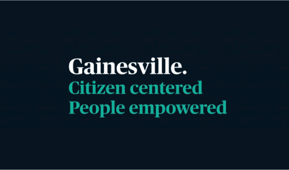
Here is the new “debrand”:
From the look of things, Gainesville has just rebranded—coming up with a new visual treatment and tagline. The new treatment in this case is type-based. Not all brand marks contain an image. For example, the age-old, though seemingly not immortal, Sears brand mark is completely type-based and has been for more than 130 years. What is important is that the brand mark has a distinctive treatment in font choice, color and size that helps it stand out.
Gainesville’s “tag mark” (tagline in disguise) — "Citizen Centered. People Empowered.", is effective, but a tagline by any other name is still…a tagline.
Branding at its best is about calling attention to a product or service or even a city in a way that illuminates a truthful, positive relationship. The city of Gainesville has certainly done that. The new brand is clean, beautiful and hopefully truthful in its presentation. But is it “debranding”?

